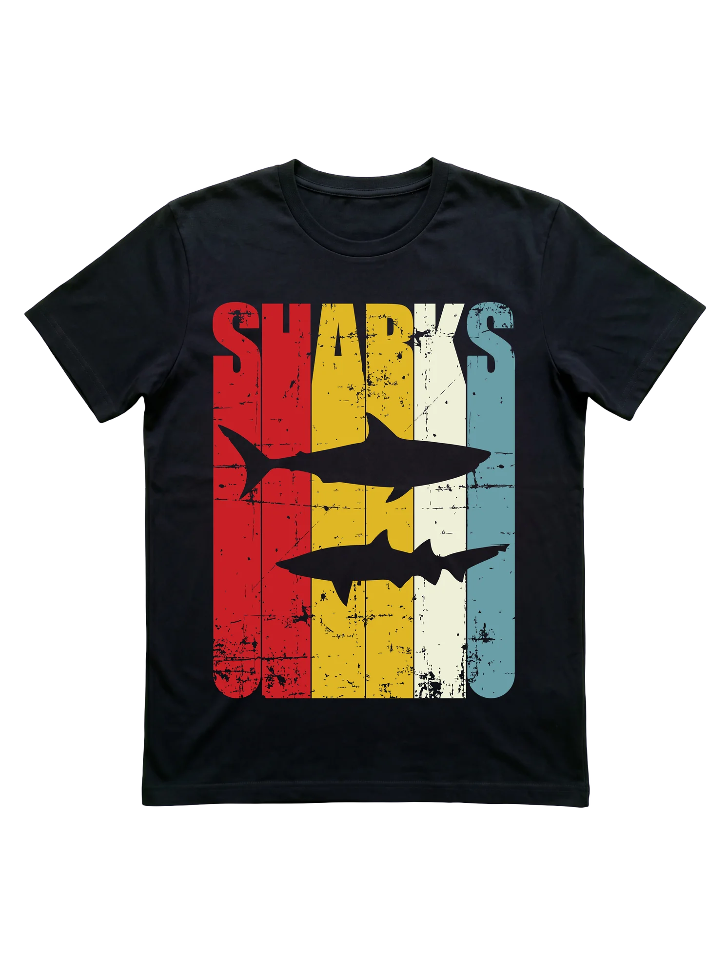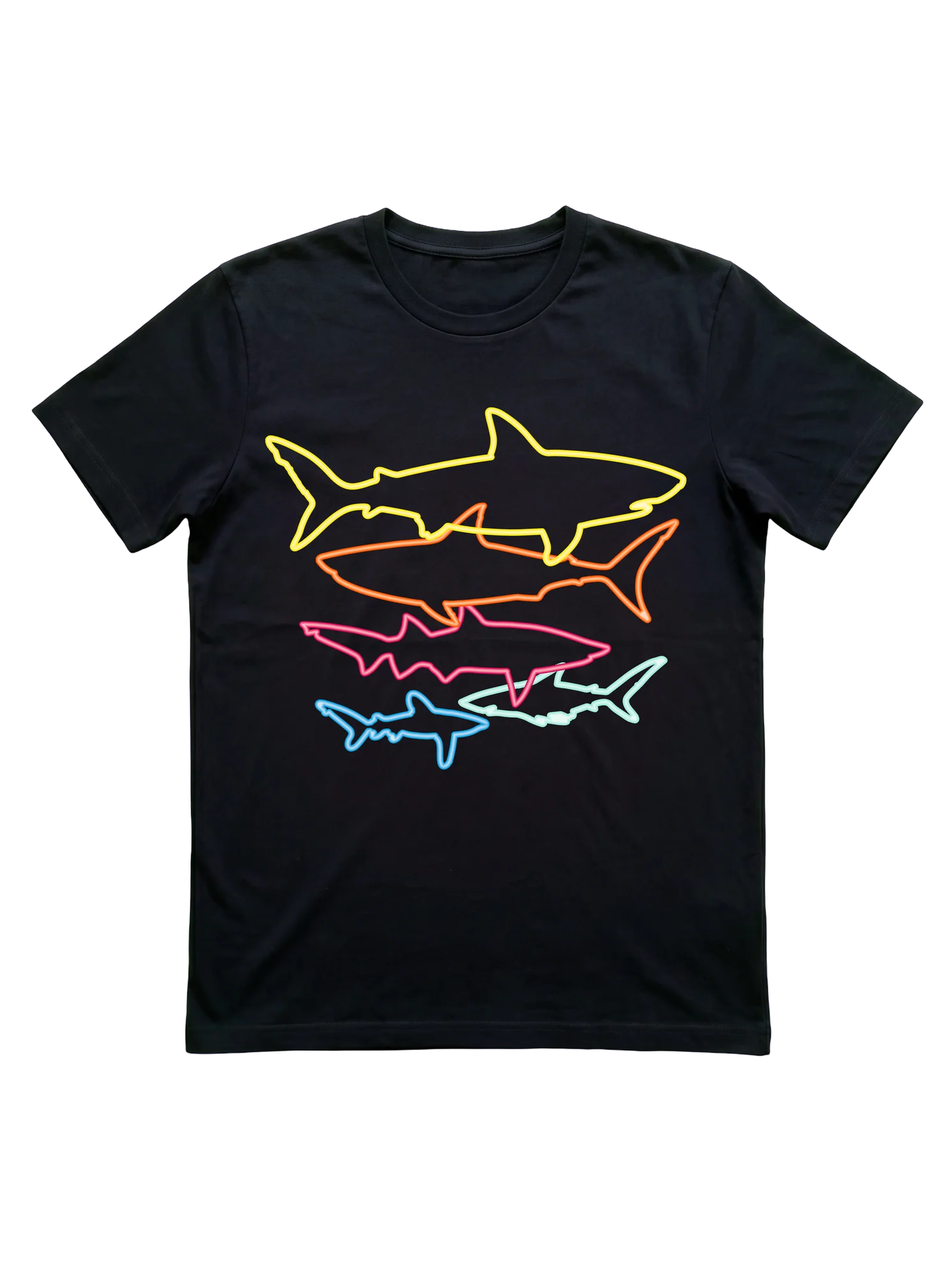
Five neon shark silhouettes stack the chest on this retro shark t-shirt
This retro shark t-shirt stacks five silhouettes up the chest in single-stroke neon outlines, descending from yellow at the top through orange, hot pink, blue, and mint at the base, all set against unbroken black ground. The composition reads like a scuba dive chart turned wearable poster. It pulls together for an aquarium-day outing with kids, a casual boardwalk walk after a snorkel session, or a Saturday farmers market browse when the conversation drifts toward apex predator facts.
- Stands out:
- Single-stroke neon outlines on pure black give each silhouette equal weight without filling them in, treating shape recognition as the entire design vocabulary.
- Worth considering:
- The neon palette pops loudest in person and washes out a bit in dim restaurant lighting, so it reads strongest in daylight and beach settings.
- Right for:
- Speaks to the Shark Mom whose weekend rotation includes aquarium visits with kids and casual snorkel trips off the local jetty.
Sponsored · affiliate link