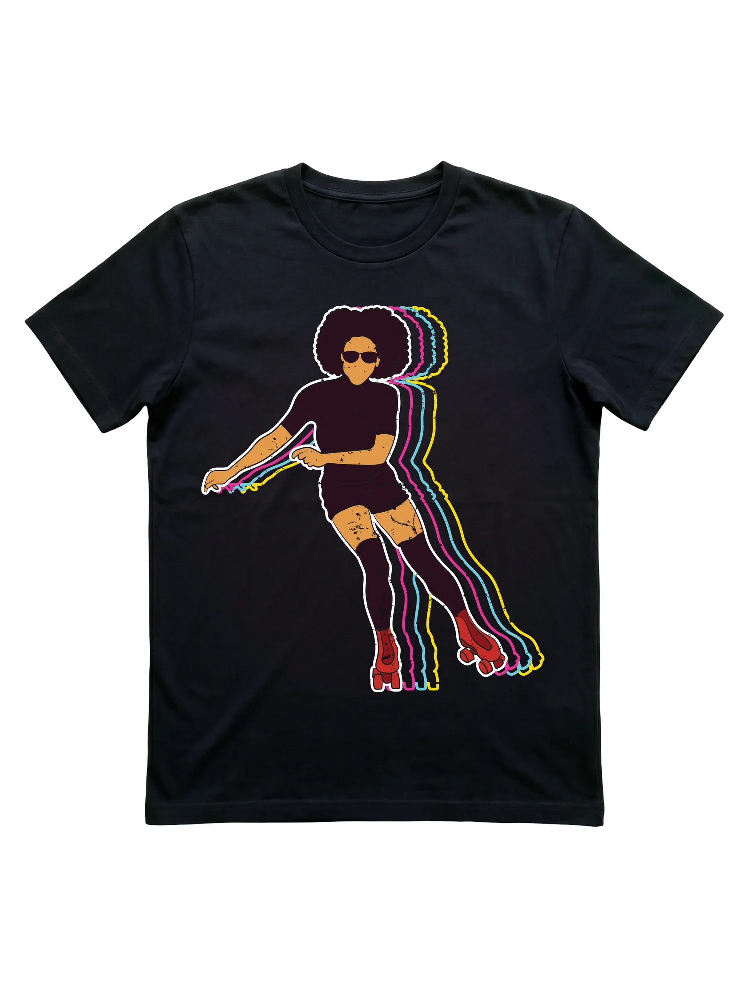
Afro silhouette on red quads anchors a retro roller skating t-shirt
A figure with a full afro and shades leans deep into a crossover stride on red quad skates, five chromatic-drift echoes in pink, cyan, and yellow trailing behind across the black field. The composition catches the exact frame where motion smears at speed. This works at a Friday roller disco where the lights strobe across the floor or on the bike path during a long outdoor session, the design reading clearly even when the wearer is mid-jam and moving past someone at full clip.
- Stands out:
- Five layered neon silhouettes stacked behind the central figure pull the eye through speed in a way that single-color prints cannot replicate.
- Worth considering:
- The dense neon composition reads loud at distance, so anyone who prefers subtle identity-wear under a jacket may want a quieter design.
- Right for:
- the roller skater whose crossovers come automatic now and who treats every Friday session as their built-in mental reset
Sponsored · affiliate link