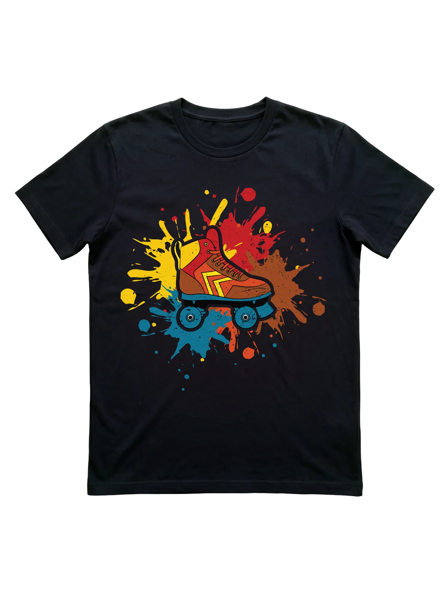
Retro Roller Skating T-Shirt with Quad Skate Burst Print
As an Amazon Associate, HoldMyTee earns from qualifying purchases. This does not change the price for you. Learn more →
A red and orange quad skate with yellow chevron detail bursts from overlapping paint splashes in yellow, red, blue, and brown on this roller skating shirt, which holds the energy at rink nights and outdoor skate meetups without a word. Fits the skater who rolls deep every session.
Save to PinterestAbout this design
The Zoomies hit differently at a nearly empty rink, that particular stretch of hardwood before the DJ shifts tempo and the session really opens up. This design runs on exactly that energy. A single quad skate in warm rust, red, and amber sits centered on a black field, the boot carrying yellow chevron detailing across its profile and a blue wheel chassis underneath. Four overlapping paint splatters in yellow, cobalt, red, and earthy brown erupt outward from the skate without a badge shape or oval frame, just kinetic burst. The composition reads as a skate session visualized rather than illustrated, the kind of momentum that keeps quad skaters circling the rink long after a casual visit has turned into a full evening.
Who this is for
This print speaks to two distinct corners of the roller skating community. First, the Quad Skater who has logged enough rink sessions to have a preferred toe stop and keeps a skate bag in the back of the car year-round. Second, the Roller Girl who came up in the 80s rink circuit or found her way back to the sport through the jam skating revival and wants the hobby visible through visual rather than verbal terms. Skate Moms who grew up in that same era will read the retro palette immediately without needing a slogan to confirm what the shirt is about. The design reads without explanation to rink regulars and occasional session riders alike.
Gift occasions
The earthy, saturated color palette anchors this design firmly in the roller rink and roller disco context rather than the derby bout or skate park scene. It reads at the warm, nostalgic end of the skating spectrum, which makes it a natural fit for someone celebrating a return to the sport, a first skate camp season, or a weekend skate jam. The high-contrast print on a black base holds its visual weight across age groups, giving it range as a gift that does not skew too young or tip too far into pure nostalgia.
Why this design fits the niche
Roller skating design language tends to split between text-heavy slogan pieces and mascot-driven character prints. This one sidesteps both. The paint-splatter composition puts it in the expressive, visually energetic category without relying on a cartoon figure or a niche-specific phrase. The retro color register, earthy reds and burnt amber, references the original 70s and 80s rink aesthetic without copying it literally. For a community that ranges from fresh-meat newcomers rolling their first backward crossover to long-time jam skaters who have been doing the Shoot the Duck since before it was on social media, the design communicates belonging through visual vocabulary rather than a printed declaration.
Styling tips
Pairs with dark-wash jeans or wide-leg skate-casual pants at the rink or a skate jam after-hours. The high-contrast print on black holds visual weight at distance without needing a bright base layer. An open flannel keeps it functional through cooler indoor rink sessions. Tucked into a high-waist skirt shifts the register toward deliberate retro.
How does this compare?
The paint-splatter burst composition puts this design on the maximalist end of the roller skating hub. For a quieter retro read, the Vintage Roller Skating T-Shirt with 80s Neon Quad Skates runs in a more contained layout, skate motif centered within a structured frame rather than erupting outward: the controlled placement reads calm against a busy rink floor rather than competing with it. On the character end of the spectrum, the Bigfoot Roller Skating T-Shirt: Retro Quad Skater Design trades the pure-skate motif entirely for a mascot figure on wheels, a tonal shift from the earnest retro energy here into humor-forward territory. The splatter version sits between those registers: more expressive than a clean badge print, more grounded than a character-illustration piece. Roller Girls and jam skaters who want the 80s rink aesthetic communicated through visual energy rather than a text declaration or a cartoon mascot will read this one differently than either sibling.
This comparison reflects our editorial picks for the niche.
Related in this hub
Frequently asked questions about Roller Skating shirts
- What's the difference between a roller skating tee for a quad skater versus a derby player?
- Quad-skater designs typically feature the full quad silhouette, often retro or rink-oriented, and use vocabulary like let's roll, skate sesh, or life is better on wheels. Derby designs lean into league-internal language: jammer, blocker, pivot positional callouts, fresh meat humor, or track rat identity claims. A quad skater might wear either, but a derby player rarely wears a generic disco tee to scrimmage because it reads as wrong context for league play.
- Do jam skating designs read differently from general roller skating designs?
- Jam skating designs pull dance and motion vocabulary into the typography itself. Phrases like that's my jam, skate sesh, or rolling deep often get layout treatments that suggest rhythm or movement. General roller skating designs are more static, anchored around the skate silhouette or a slogan. A jam skater wearing a generic rink design reads fine, but the inverse, a rink regular in a jam-skating-coded shirt, signals dance-floor identity that may not match.
- What sizing works for a tee worn over a sports bra at derby scrimmage?
- Derby scrimmage and bout wear usually trends one size up from street fit, since skaters layer over a sports bra and need range of motion through shoulder and torso during blocking and pivot rotations. Many derby players keep separate tee rotations for league wear and street wear, with the league-wear tees sized looser. For casual rink wear and roller disco nights, standard street fit works fine.
- Are retro disco roller skating designs taken seriously, or do they read as costume?
- Retro 70s and 80s designs read as authentic skating heritage to most niche audiences, not as costume. The roller disco aesthetic predates current skating culture and is treated as core nostalgia rather than dress-up. Sunburst typography, boardwalk silhouettes, and disco-era color blocking land cleanly at roller disco nights and Friday rink sessions. The exception is fully period-styled gold-lamé treatments, which cross into theme territory.
- What design language signals fresh meat versus established derby player?
- Fresh meat designs lean into the rookie identity directly, sometimes with humor about the early training phase, the bruise count, or the steep first-year learning curve. Established player designs use positional language (jammer, blocker, pivot), track rat identity claims, or bout-count humor. A skater in their first six months often gravitates toward fresh meat graphics as a way to own the rookie status, while veterans default to positional or league-anchored designs.
- Why do most quad-skater designs avoid inline-skate silhouettes entirely?
- Quad and inline skating split the broader roller skating world into two cultures that share wheels but little else in style, vocabulary, or community. Quad skaters identify strongly with the four-wheel two-by-two silhouette and toe-stop profile, and designs that show inline outlines read as wrong audience. Most roller disco, derby, and jam skating designs explicitly use the quad outline. Inline-coded designs sit in a separate rollerblading category with its own visual language.
- Which roller skating designs work for both rink sessions and casual street wear?
- Statement-text designs (life is better on wheels, keep rolling, skating is therapy) and retro-disco graphics with sunburst typography cross over cleanly. Both read as identity wear off-skate and as belonging on-skate. Derby-positional designs and fresh meat graphics tend to stay closer to league contexts, since the vocabulary signals league membership to anyone who recognizes it. For a skater who wants one tee that works rink, boardwalk, and grocery run, the slogan-and-silhouette designs travel furthest.
Also in
You might also like
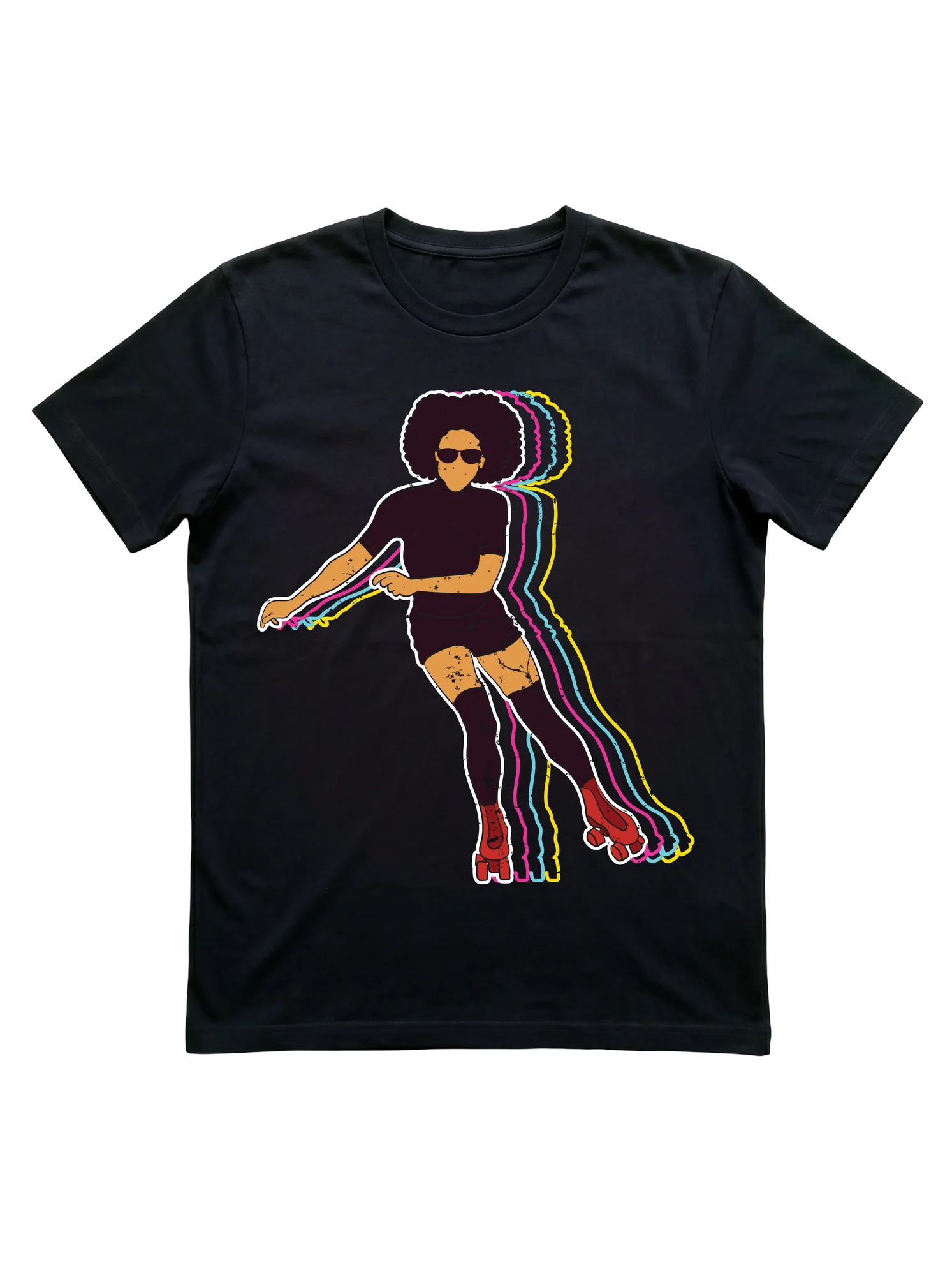 Retro 70s Roller Skating T-Shirt for WomenRoller Skating
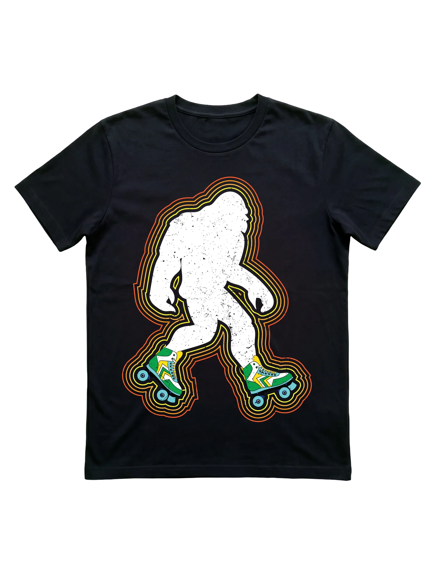 Bigfoot Roller Skating T-Shirt: Retro Quad Skater DesignRoller Skating
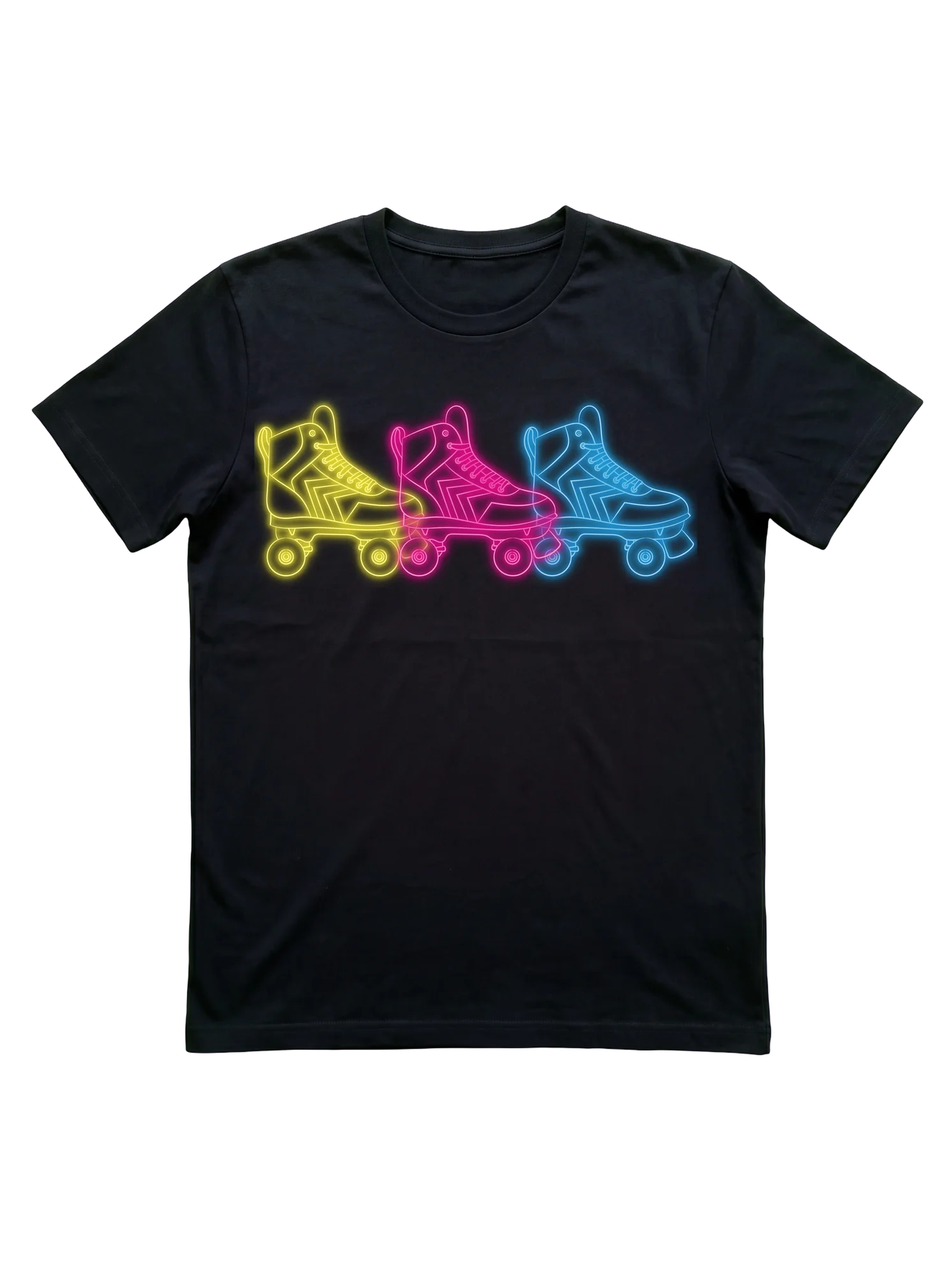 Vintage Roller Skating T-Shirt with 80s Neon Quad SkatesRoller Skating
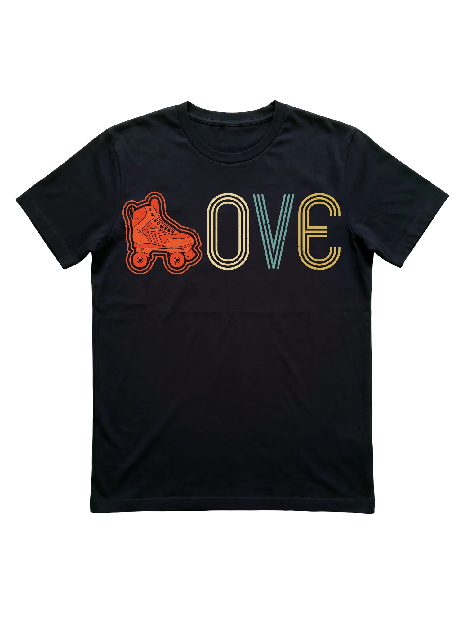 Roller Skating LOVE T-Shirt with Retro Quad Skate DesignRoller Skating
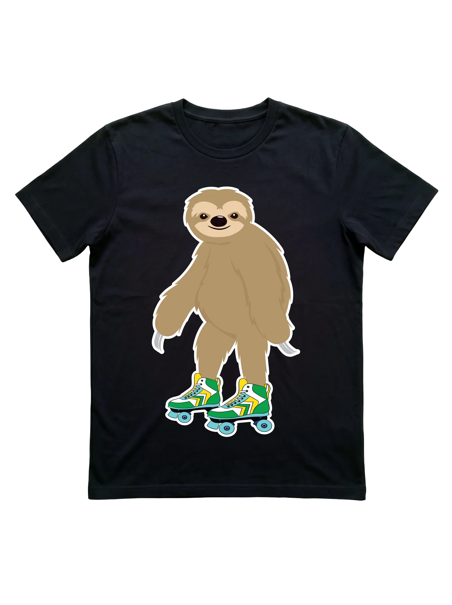 Roller Skating Sloth T-Shirt for Rink LoversRoller Skating
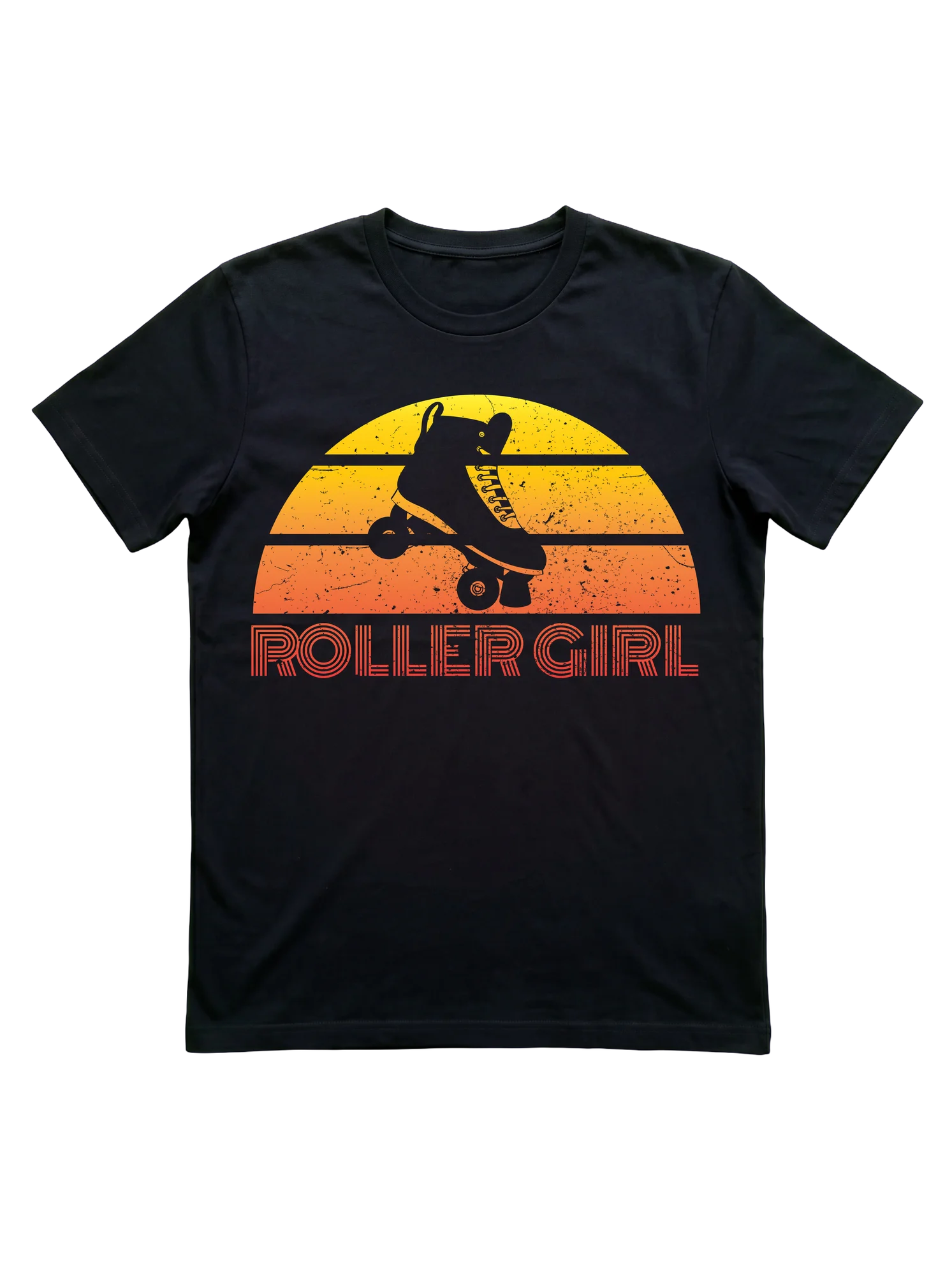 Vintage Roller Girl T-Shirt with Retro 80s SunsetRoller Skating