Bigfoot Roller Skating T-Shirt: Retro Quad Skater Design
As an Amazon Associate, HoldMyTee earns from qualifying purchases. This does not change the price for you. Learn more →
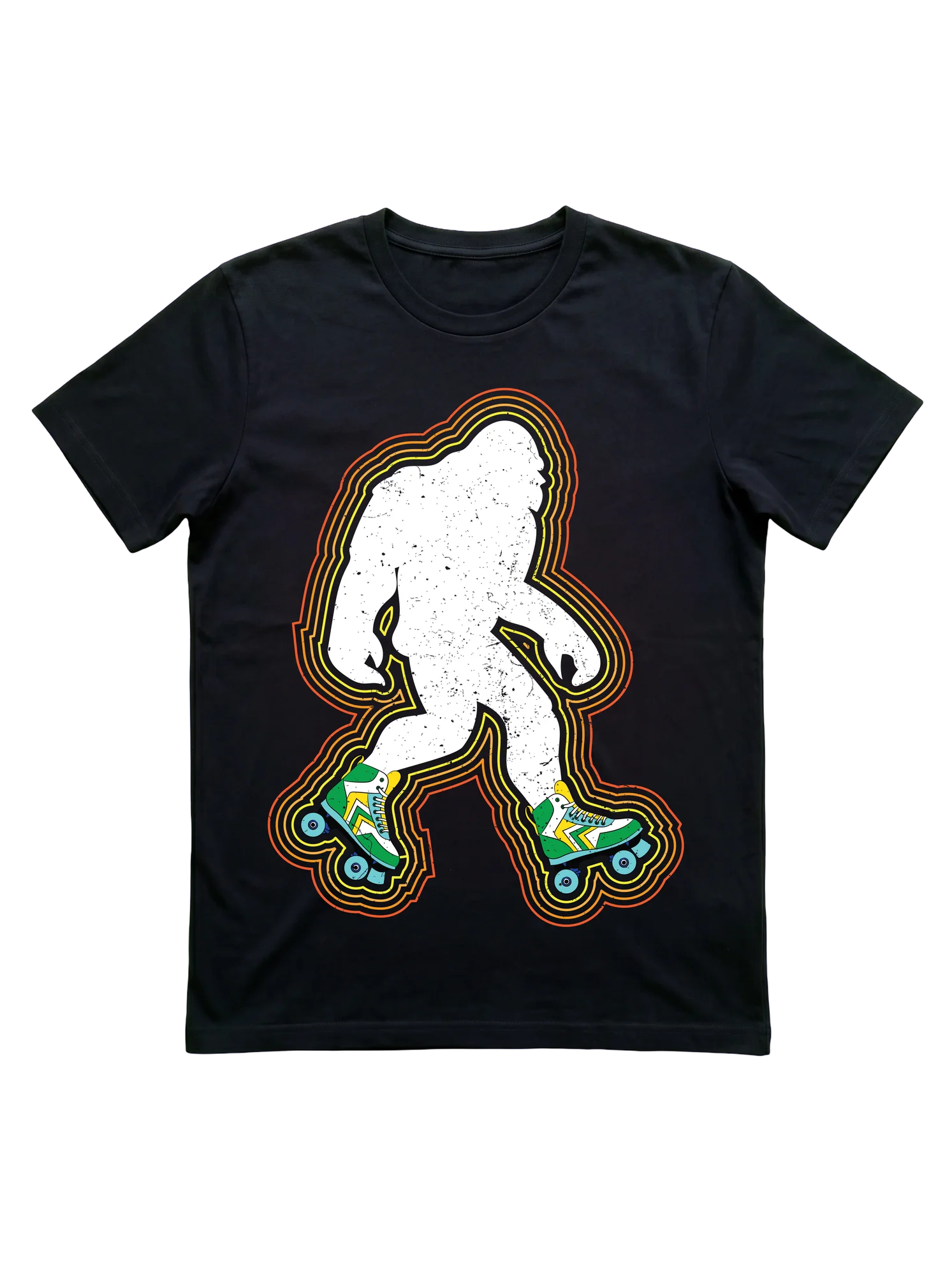
A distressed white Bigfoot silhouette strides on green and yellow quad skates, wrapped in retro red-to-yellow outline halos on this roller skating shirt, which lands the joke without a single word. Reads at rink nights and outdoor skate meetups, fits the skater who carries the humor onto the floor.
Save to PinterestAbout this design
That moment at a rink when the floor clears and the skaters who know exactly what to do with the space start moving: this design lives in that register of roller skating culture.
Bigfoot appears in a fully distressed white silhouette, mid-stride, on a pair of vintage quad roller skates rendered in green-and-white with yellow chevron accent plates and blue wheels. A multi-layer neon contour outline radiates outward from the figure in a red-orange-yellow gradient sequence, referencing the treatment found in 1980s roller disco poster art. The composition is character-forward: the figure occupies most of the print area on a solid black background. No text appears in the design. The distressed texture on the silhouette gives the print the grain of an aged screen print rather than a contemporary flat graphic.
Who this is for
Quad skaters who came up at rink sessions or outdoor boardwalk skating runs carry a specific aesthetic memory: the color palette and graphic conventions of late-1970s and early-1980s skating culture. This design draws from that era directly. The Bigfoot element adds absurdist humor that reads clearly at a skate jam or Saturday rink session without needing explanation from the wearer.
Newer-generation quad skaters leaning deliberately into retro aesthetics as a style register respond to this treatment just as readily. The cryptid concept extends the shirt's reach beyond the skating community: it reads as vintage poster art to anyone outside the niche while landing as a specific skating-culture reference to those inside the skating community.
Gift occasions
Skate jams, roller disco nights, and skate camp send-offs are the natural contexts for this print. The Bigfoot concept gives it staying power outside any specific seasonal window since it does not rely on holiday timing to land. A Skater Mom or Skater Dad looking for something for a quad skater in their life gets a retro treatment that registers with the niche more precisely than a generic slogan shirt.
The design also suits a long-time roller skater who has accumulated gear but still responds to prints that reflect the actual visual history of the sport rather than contemporary minimalist approaches.
Why this design fits the niche
Roller skating carries a recognizable retro visual heritage: rainbow stripes, neon outlines, and the 1980s color palette appear consistently throughout skating community aesthetics and rink culture events. The Bigfoot figure, normally associated with wilderness and cryptid communities, gets absorbed into skating identity through one specific detail: the skates. These are not generic wheels. The green-and-white quad boot with yellow plate detailing and blue wheels is drawn with enough specificity that quad skate community members recognize the reference immediately. That level of detail separates this print from a surface-level novelty concept and communicates genuine familiarity with actual quad skate equipment and the visual culture surrounding it.
Styling tips
The bold neon outline reads clearly at rink lighting and outdoor skate jam settings alike. The solid black background suits layering under an open overshirt at cooler outdoor skating spots like a boardwalk or bike path session. The character-forward composition sits centered on the chest and reads cleanly even when the wearer is seated rink-side between skate sessions.
How does this compare?
Roller skating shirts in this niche generally fall into two visual registers: text-heavy designs built around community phrases from 'Skate Sesh' to 'Keep Rolling,' and character-illustrated prints with flat fills and simple color treatment. This Bigfoot design occupies a distinct third register. The distressed silhouette combined with a multi-layer neon contour outline references vintage roller disco poster art from the 1970s and 1980s rather than contemporary graphic tee conventions. The full-detail quad boot rendering, including the specific green-and-white coloring and yellow plate accents, grounds the cryptid concept in recognizable skating-culture iconography rather than generic novelty territory. The overall treatment runs maximalist and character-forward: more visual surface area than a slogan tee, more niche-specific detail than a casual cryptid print.
This comparison reflects our editorial picks for the niche.
Related in this hub
Frequently asked questions about Roller Skating shirts
- What's the difference between a roller skating tee for a quad skater versus a derby player?
- Quad-skater designs typically feature the full quad silhouette, often retro or rink-oriented, and use vocabulary like let's roll, skate sesh, or life is better on wheels. Derby designs lean into league-internal language: jammer, blocker, pivot positional callouts, fresh meat humor, or track rat identity claims. A quad skater might wear either, but a derby player rarely wears a generic disco tee to scrimmage because it reads as wrong context for league play.
- Do jam skating designs read differently from general roller skating designs?
- Jam skating designs pull dance and motion vocabulary into the typography itself. Phrases like that's my jam, skate sesh, or rolling deep often get layout treatments that suggest rhythm or movement. General roller skating designs are more static, anchored around the skate silhouette or a slogan. A jam skater wearing a generic rink design reads fine, but the inverse, a rink regular in a jam-skating-coded shirt, signals dance-floor identity that may not match.
- What sizing works for a tee worn over a sports bra at derby scrimmage?
- Derby scrimmage and bout wear usually trends one size up from street fit, since skaters layer over a sports bra and need range of motion through shoulder and torso during blocking and pivot rotations. Many derby players keep separate tee rotations for league wear and street wear, with the league-wear tees sized looser. For casual rink wear and roller disco nights, standard street fit works fine.
- Are retro disco roller skating designs taken seriously, or do they read as costume?
- Retro 70s and 80s designs read as authentic skating heritage to most niche audiences, not as costume. The roller disco aesthetic predates current skating culture and is treated as core nostalgia rather than dress-up. Sunburst typography, boardwalk silhouettes, and disco-era color blocking land cleanly at roller disco nights and Friday rink sessions. The exception is fully period-styled gold-lamé treatments, which cross into theme territory.
- What design language signals fresh meat versus established derby player?
- Fresh meat designs lean into the rookie identity directly, sometimes with humor about the early training phase, the bruise count, or the steep first-year learning curve. Established player designs use positional language (jammer, blocker, pivot), track rat identity claims, or bout-count humor. A skater in their first six months often gravitates toward fresh meat graphics as a way to own the rookie status, while veterans default to positional or league-anchored designs.
- Why do most quad-skater designs avoid inline-skate silhouettes entirely?
- Quad and inline skating split the broader roller skating world into two cultures that share wheels but little else in style, vocabulary, or community. Quad skaters identify strongly with the four-wheel two-by-two silhouette and toe-stop profile, and designs that show inline outlines read as wrong audience. Most roller disco, derby, and jam skating designs explicitly use the quad outline. Inline-coded designs sit in a separate rollerblading category with its own visual language.
- Which roller skating designs work for both rink sessions and casual street wear?
- Statement-text designs (life is better on wheels, keep rolling, skating is therapy) and retro-disco graphics with sunburst typography cross over cleanly. Both read as identity wear off-skate and as belonging on-skate. Derby-positional designs and fresh meat graphics tend to stay closer to league contexts, since the vocabulary signals league membership to anyone who recognizes it. For a skater who wants one tee that works rink, boardwalk, and grocery run, the slogan-and-silhouette designs travel furthest.
Also in
You might also like
 Retro 70s Roller Skating T-Shirt for WomenRoller Skating
 Vintage Roller Skating T-Shirt with 80s Neon Quad SkatesRoller Skating
 Roller Skating LOVE T-Shirt with Retro Quad Skate DesignRoller Skating
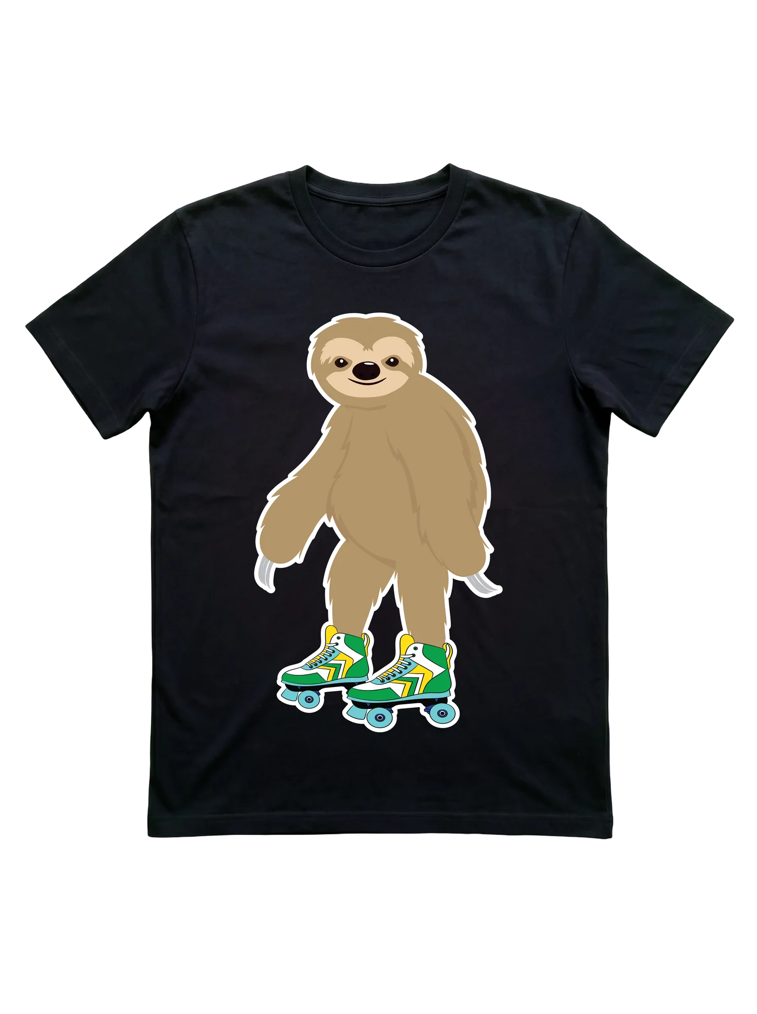 Roller Skating Sloth T-Shirt for Rink LoversRoller Skating
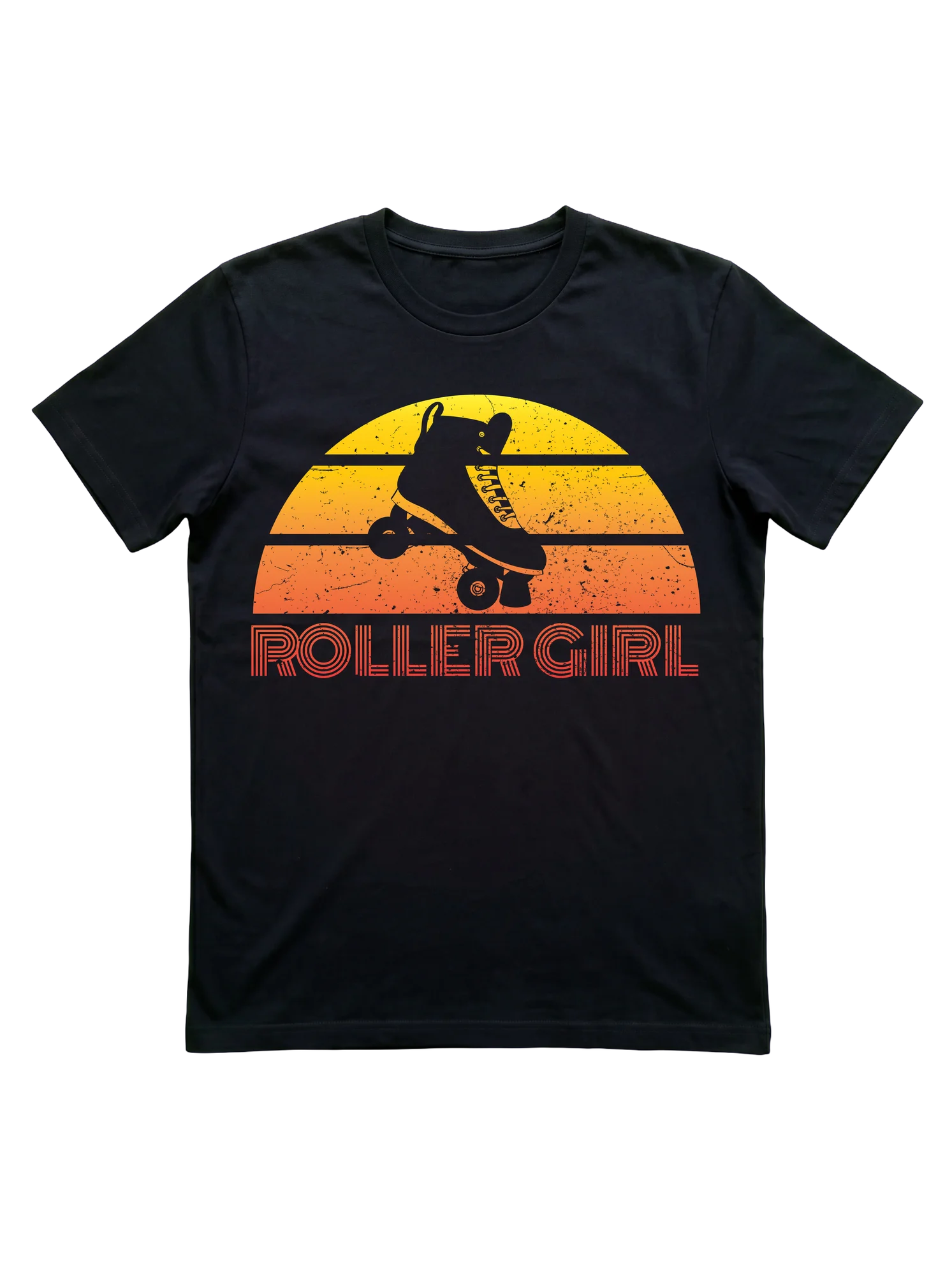 Vintage Roller Girl T-Shirt with Retro 80s SunsetRoller Skating
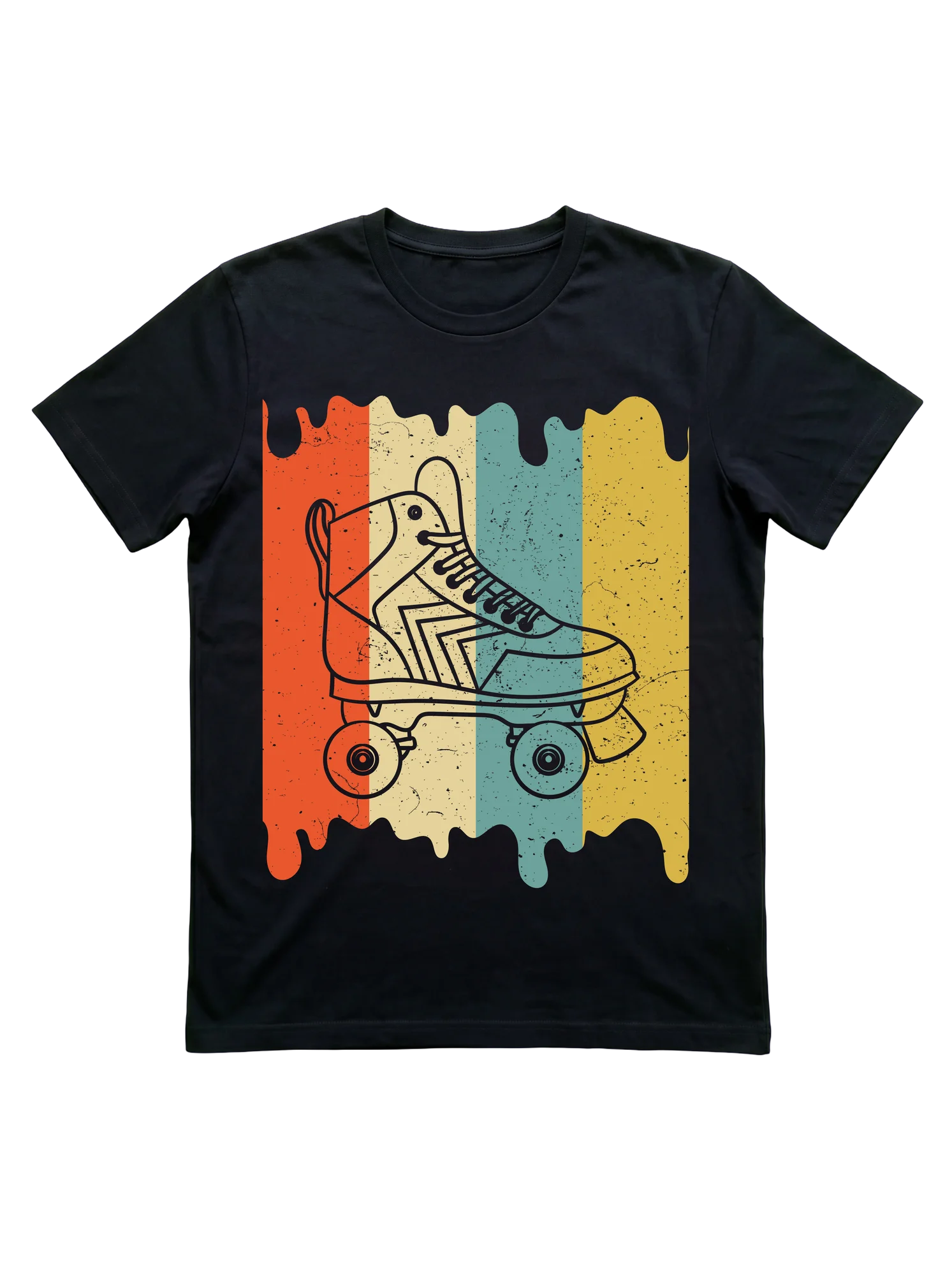 80s Retro Roller Skating Shirt for Rink LoversRoller Skating