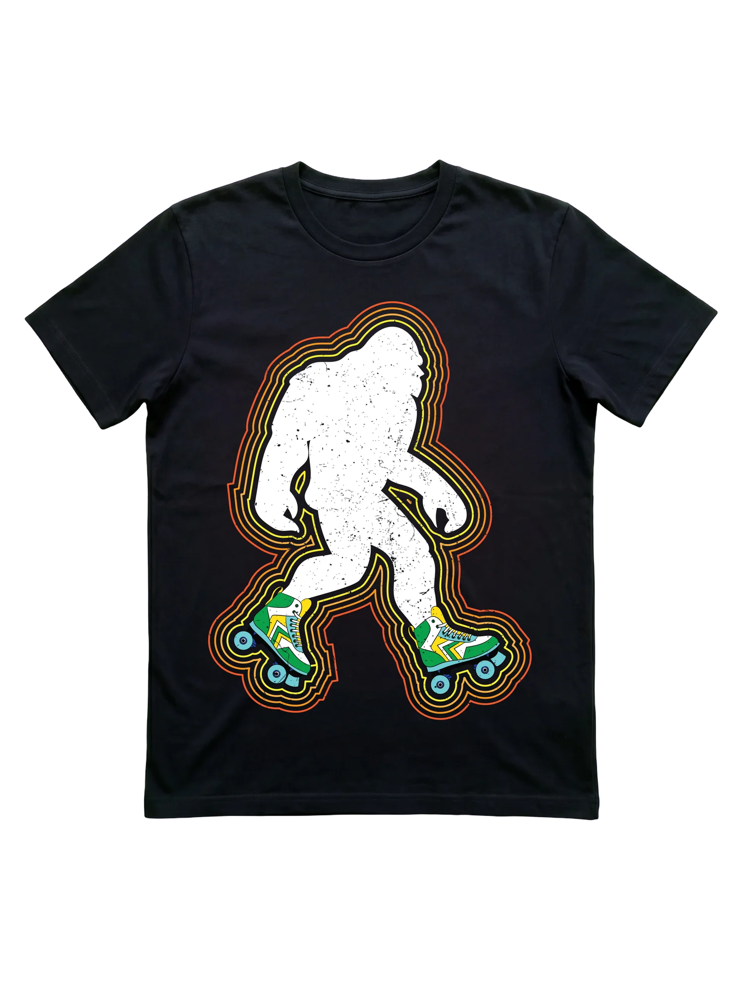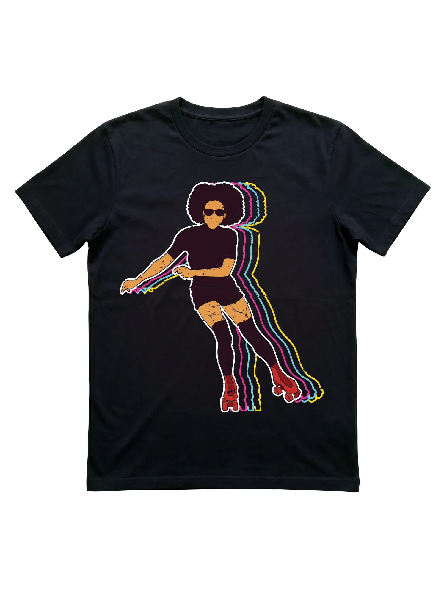
Afro silhouette on red quads carries the roller disco aesthetic
A stylized figure with a full natural afro and shades leans deep into a roller skating stride on red quad skates, with neon contour echoes in pink, cyan, and yellow stacking behind the body like a chromatic drift. The composition pulls from the disco-era visual vocabulary that defines the roller disco scene, and the dark crop top with thigh-high socks reads as motion-aware uniform rather than costume. The shirt works during Friday rolling sessions when the lights drop and the bass picks up, or earlier in the evening when skaters compare new jam moves before the floor opens.
- Stands out:
- Five layered neon silhouette echoes in pink, cyan, and yellow trail the figure across a flat black field.
- Worth considering:
- The motif leans loud and figurative, which suits expressive skaters more than people who prefer abstract or text-driven graphics.
- Right for:
- The roller girl whose Friday rolling sessions are timed to bass drops will read this composition instantly without needing the visual decoded.
Sponsored · affiliate link