Anatomy of an Otter Labels the Body Parts Only Otter Fans Recognize
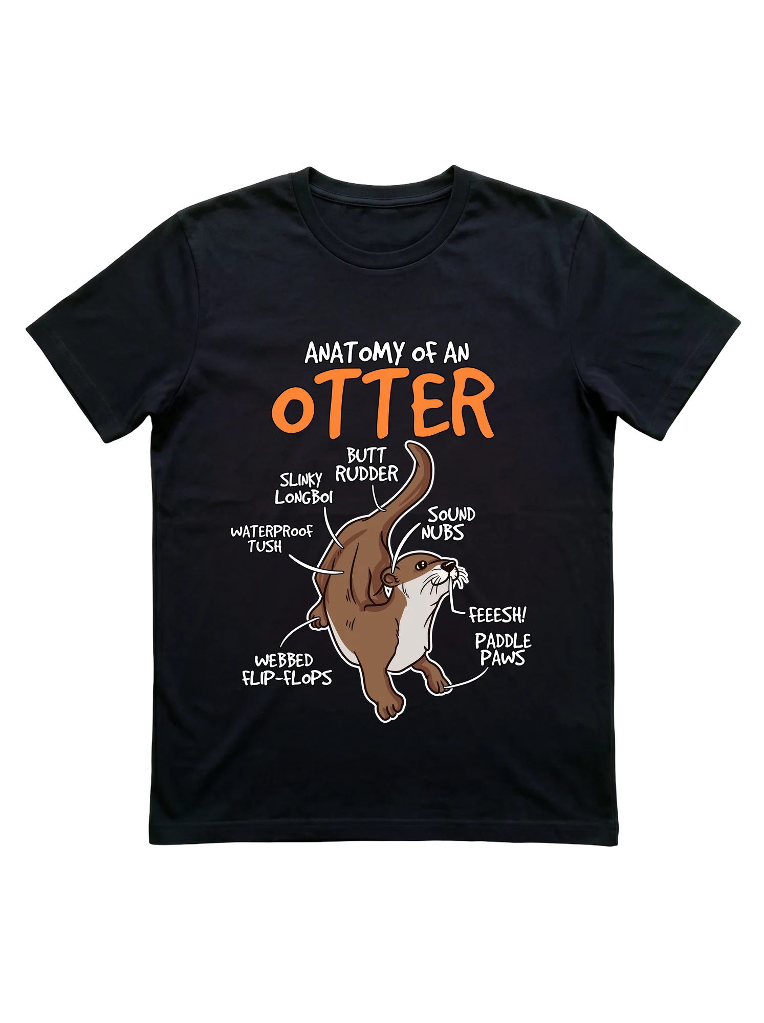
A warm brown cartoon otter stretches mid-pose on white ground, with orange bubble lettering above and black callout arrows fanning to handwritten labels reading butt rudder, slinky longboi, waterproof tush, webbed flip-flops, paddle paws, sound nubs, and feeesh. The taxonomy joke lands at aquarium feedings when the otter actually rolls onto its back to crack a clam against its chest, turning every callout into a live demonstration. Kids point at the labels first, parents catch the slinky longboi line a second later, and the whole shirt does the explaining.
- Stands out:
- Handwritten label callouts arranged around the figure read like a real biology poster, but every term is community slang rather than Latin.
- Worth considering:
- The text-heavy layout reads best at close range, so it works less well as a back-of-the-room conversation piece.
- Right for:
- The Otter Mom whose kids quote the slinky longboi label every time they spot one floating belly-up in the aquarium tank.
Sponsored · affiliate link